Portland Timbers Home Jersey Evolution | A Complete Guide by SoccerJerseyCA
Table of Contents
The Portland Timbers home jersey is more than a match-day uniform. It reflects the club’s identity, the city’s culture, and the evolution of Major League Soccer itself. From early minimalist designs to modern, story-driven kits, the Portland Timbers home jersey evolution tells a clear story of tradition, ambition, and fan connection.
This comprehensive guide by SoccerJerseyCA breaks down the evolution of the Timbers’ home jersey, explains the reasons behind these changes, and highlights what makes certain editions truly iconic.
The Portland Timbers’ Home Jersey’s Appeal to Fans
Before diving into timelines and design changes, it’s essential to understand why the home jersey holds exceptional value.
For Timbers supporters, the home kit represents:
- Club identity and local culture
- Matchday tradition at Providence Park
- Emotional memories tied to specific seasons
Unlike away or third kits, the home jersey stays visually consistent. That consistency makes every small change meaningful.
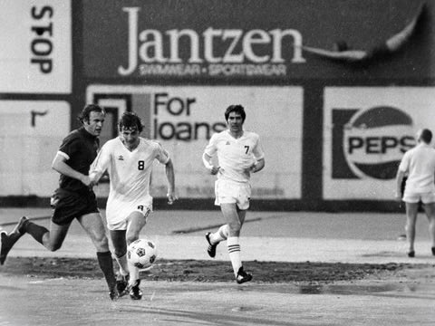
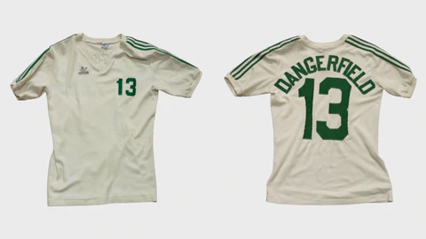
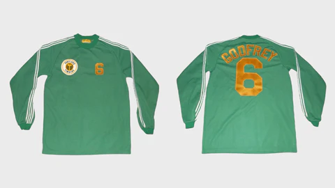
Early Roots – What Did the First Portland Timbers Home Jerseys Look Like?
The NASL Era and Pre-MLS Influence
The Portland Timbers name dates back to the 1970s NASL era. While modern MLS branding didn’t exist yet, the foundation was set early.
Key characteristics of early Timbers home jerseys:
- Simple green base
- Minimal striping or detailing
- Focus on functionality over branding
These early designs established green as the unmistakable core color that still defines the Portland Timbers home jersey evolution today.
Enter MLS – How Did the Home Jersey Change After 2011?
The MLS Expansion Era (2011–2013)
When the Portland Timbers joined Major League Soccer in 2011, the home jersey received its first major modernization.


Key updates during this period:
- Cleaner, athletic fit
- Deeper green tones
- Introduction of MLS-standard branding and patches
The goal was balance. The club needed to look modern while staying true to its roots.
This phase marked the true starting point of the modern Portland Timbers home jersey evolution.
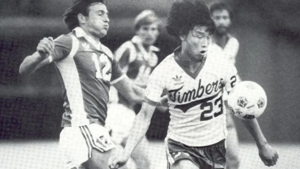
The Rise of Symbolism – When Did Jerseys Start Telling Stories?
Adding Meaning Beyond Color (2014–2016)
As MLS matured, clubs began using jerseys to tell stories. Portland was one of the leaders in this approach.

Home jerseys during this phase often featured:
- Subtle horizontal or diagonal striping
- Texture patterns inspired by forests and timber
- Deeper references to the Pacific Northwest
These details weren’t always apparent from a distance. That was intentional. The Timbers favored understated symbolism over loud graphics.
Championship Influence – How Success Shaped Jersey Design
Post-MLS Cup Identity Shift (2016–2018)
After winning the MLS Cup, the Timbers’ identity gained national recognition. That success influenced jersey design choices.


Notable changes included:
- More confident use of gold or metallic accents
- Refined badge placement
- Cleaner sponsor integration
The home jersey during this period felt more polished. It reflected a club that had proven itself on the biggest stage.
Modern Minimalism – Why Did Designs Become Simpler Again?
The Return to Clean Design (2019–2021)
Interestingly, after years of added texture and symbolism, the Portland Timbers’ home jersey evolution shifted back toward simplicity.

Reasons for this change:
- Better readability on broadcasts
- Stronger brand recognition with fewer elements
- Fan demand for timeless designs
Instead of complex patterns, the focus returned to:
- Strong green base
- Crisp contrast details
- Balanced proportions
This era produced several jerseys that fans now consider modern classics.
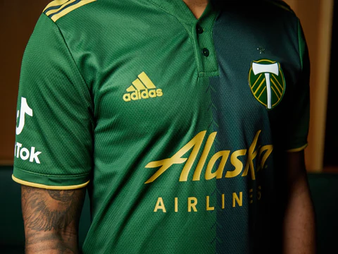
Recent Seasons – How Have the Latest Home Jerseys Evolved?
Sustainability, Fit, and Subtle Detail (2022–Present)
In recent seasons, changes to the home jersey have been more subtle but more intentional.
Key trends include:
- Improved fabric technology
- Lightweight, breathable materials
- Micro-patterns visible only up close
The Portland Timbers home jersey evolution now focuses less on dramatic visual change and more on comfort, longevity, and responsible production.


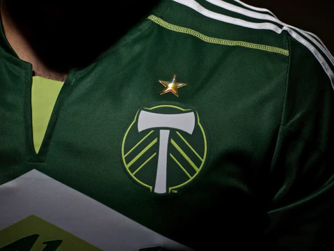
Design Breakdown – What Makes a Timbers Home Jersey Instantly Recognizable?
Core Design Elements Explained
Across all eras, certain features remain consistent.
Key identifiers:
- Forest green is the dominant color
- Crest placement over the heart
- Clean, athletic silhouette
Optional design elements that change by season:
- Striping direction
- Collar style
- Accent colors
This balance between consistency and variation is what keeps the home jersey fresh without losing identity.
How Does the Portland Timbers Home Jersey Compare to Other MLS Teams?
Standing Out Through Restraint
Many MLS clubs use bold graphics or experimental colors. Portland takes a different approach.
Compared to other teams:
- Less reliance on neon or extreme contrast
- More focus on tradition
- Stronger connection to local culture
This approach has helped the Portland Timbers’ home jersey evolve well compared to trend-heavy designs from other clubs.
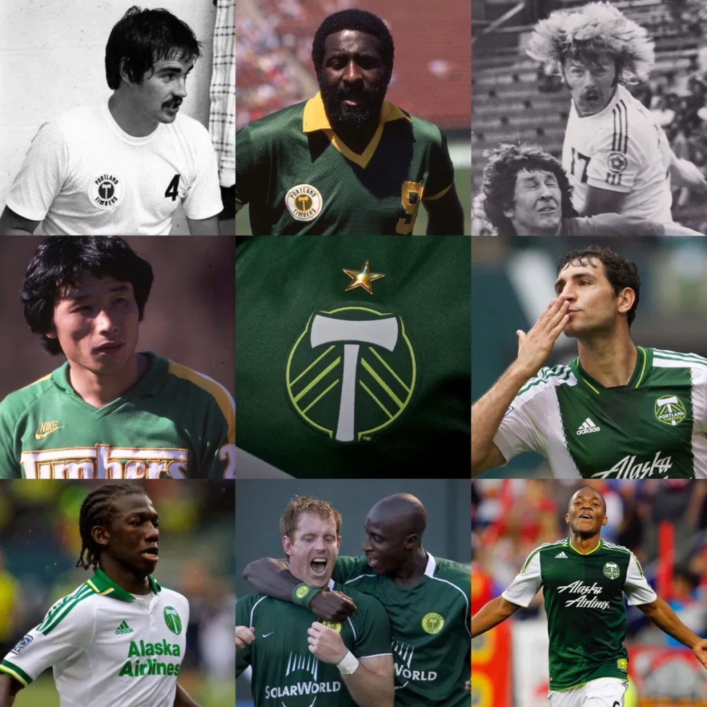
Which Portland Timbers Home Jerseys Are Considered Iconic Today?
Fan-Favorite Eras
While opinions vary, certain home jerseys consistently rank high among supporters.
Commonly praised features include:
- Simplicity and wearability
- Emotional connection to successful seasons
- Balanced modern-retro design
These jerseys are often sought after by collectors and fans who prefer timeless pieces over trend-driven designs.
Are Retro and Replica Home Jerseys Worth Buying?
Practical Advice for Fans and Collectors
Many fans search for older Timbers home jerseys but face limited availability. This has made high-quality replicas increasingly popular.
Why replicas make sense:
- Authentic look without high resale pricing
- Easier sizing options
- Suitable for both matchdays and casual wear
For fans who prioritize style and history over officially issued match merchandise, replicas offer substantial value.
How SoccerJerseyCA Approaches Portland Timbers Home Jerseys
At SoccerJerseyCA, our focus is on accuracy, comfort, and visual fidelity.
When selecting or producing Portland Timbers home jerseys, attention is given to:
- Correct color tones
- Accurate crest proportions
- Clean stitching and fabric feel
The goal is to let fans experience the complete evolution of the Portland Timbers home jersey through wearable, well-crafted designs.
FAQ – Common Questions About Portland Timbers Home Jersey Evolution
Has the home jersey color ever changed from green?
No. Green has always remained the foundation of the Timbers’ home identity, even as shades and accents evolved.
Why do some jerseys look similar year to year?
Consistency is intentional. The club values long-term identity over short-term design trends.
Are older designs still relevant today?
Yes. Many older home jerseys are considered timeless and remain popular with fans and collectors.
Why the Portland Timbers Home Jersey Evolution Matters
The Portland Timbers home jersey evolution is not about radical redesigns. It’s about thoughtful refinement.
Each era reflects:
- Where the club was competitively
- How MLS itself was evolving
- What fans valued at the time
That steady evolution is what gives Timbers jerseys lasting appeal.
For supporters, collectors, or anyone curious about MLS kit history, understanding this evolution adds depth to every matchday experience. And for those looking to wear that history today, SoccerJerseyCA continues to make those iconic designs accessible—season after season.